A professional interface is more than a polished screen. It communicates priorities, supports decisions, and explains what happened after an action. AI can generate visual options quickly, but the team still needs to decide which option fits the user's context and the product's purpose.
Start with the user's task
Define who is using the product, what they want to accomplish, and what constraints they face. A first-time customer comparing services needs different information from an experienced operator processing dozens of requests. Those differences should shape navigation, wording, and the amount of guidance shown.
Use interviews and observation to understand the existing journey. AI can help organise notes, but it should not invent findings or turn assumptions into evidence. Keep the distinction between what participants actually said, what the team observed, and what remains a hypothesis. That distinction makes later design choices easier to evaluate.
Use AI to explore alternatives
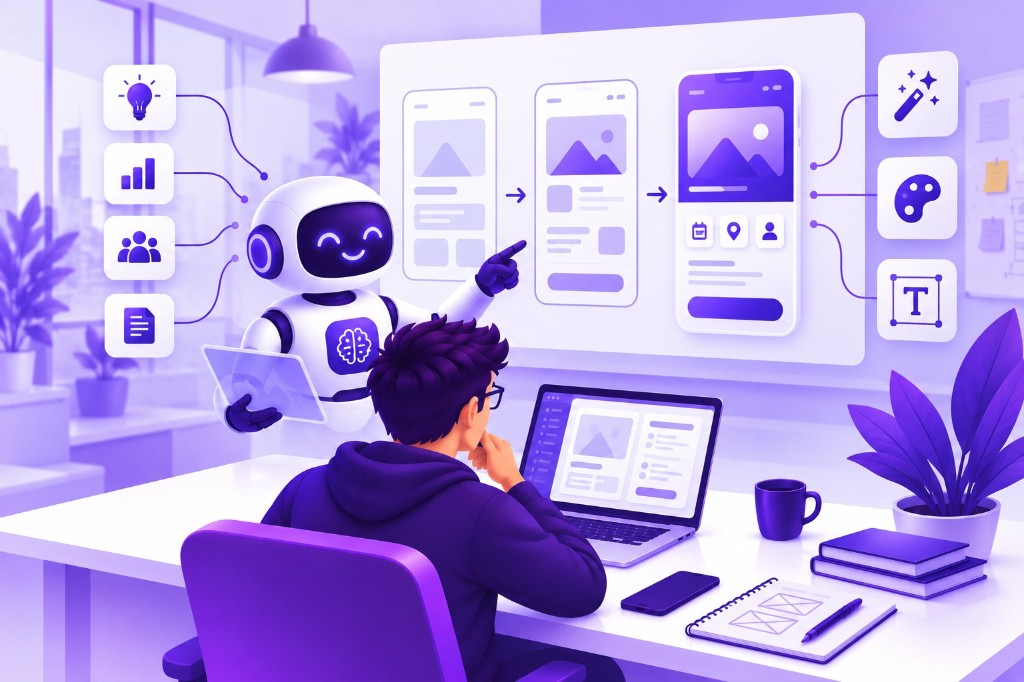
Generate several approaches to a specific problem, such as comparing plans or reviewing an approval. A useful prompt includes the task, audience, constraints, and information hierarchy. The purpose is to widen the set of options you can examine, not to select the first attractive result.
Compare alternatives against the same criteria. Can users identify the next action? Is the important information visible at the right moment? Does the layout remain clear with realistic content? An option that looks elegant with short sample text may fail when product names, error messages, or translated labels become longer.
Keep design systems coherent
AI-generated screens can introduce inconsistent spacing, colours, controls, and terminology. Establish reusable patterns for buttons, forms, cards, navigation, and feedback. These patterns reduce cognitive effort for users and help developers implement the product without interpreting each screen as a separate design language.
Document the rules that matter: when to use a primary action, how errors appear, and what a selected state means. A component library is useful only when the team knows how to apply it. Review generated work against those rules instead of treating visual consistency as a final cleanup task.
Example: redesigning a project enquiry form
Suppose a service business asks visitors for technical specifications before they can request help. Users may not know the terminology and abandon the form. AI can produce alternative wording and shorter layouts, but the underlying design decision is to ask about the business problem rather than demand a solution specification.
A prototype might begin with the desired outcome, an optional service choice, and a short description. Test whether representative visitors understand the questions and know what happens after submission. Compare completion and confusion, not only visual preference. The best design is the one that helps the intended person take a meaningful next step.
Design the states between screens
Loading, empty, error, and success states are part of the experience. A generated mockup often shows a populated dashboard but not what a new user sees before any data exists. Define those moments deliberately so people can understand the product without needing a support message at every interruption.
Pay attention to feedback after consequential actions. If a submission fails, preserve useful input and explain how to continue. If an action cannot be reversed, make the consequence clear before it happens. Animation should help communicate change rather than obscure it or make the user wait unnecessarily.
Test accessibility and responsiveness
Review keyboard navigation, focus visibility, form labels, text contrast, and readable sizing. Test the layout at smaller screens and with longer content. W3C's WCAG guidance is a useful reference, but accessibility work also requires checking the actual implementation and the tasks people need to complete.
Motion deserves attention too. Respect reduced-motion preferences and avoid making animation the only way to understand status. A rotating card or hover-only interaction may be difficult on a phone or with a keyboard. Prefer controls that remain understandable when the decorative effects are removed.
Validate before development expands
Give representative users a realistic task and observe what they do. Avoid explaining the interface while they test it, because that can hide unclear labels or missing information. Record where they hesitate and whether they reach the intended outcome. A few focused sessions can reveal problems that a team review misses.
Use feedback to revise the flow before implementing every screen. Keep a record of the decisions and the reason behind them. This prevents future changes from reintroducing an issue that was already discovered. AI can accelerate iteration, but someone must decide which feedback reflects a pattern and which needs further investigation.
AI-assisted design checklist
- The audience and primary task are defined before generating screens.
- Research observations are kept separate from assumptions.
- Alternatives are evaluated against usability, not appearance alone.
- Shared components and terminology remain consistent.
- Responsive, keyboard, and reduced-motion behaviour are considered.
- Representative users test realistic tasks before the scope expands.
During a design review, compare the generated interface with a real task from beginning to end. Ask participants to explain what they expect each control to do before clicking. Differences between expectation and behaviour reveal problems that a visually polished screen can easily conceal.
Frequently asked questions
Can AI replace user research?
No. AI can help prepare questions or organise existing material, but it cannot substitute for evidence about your actual users. Treat generated personas and predicted preferences as hypotheses. Validate important assumptions through observation, interviews, or task-based testing.
Are more visual options always better?
Not necessarily. Too many variations can distract from the problem. Define evaluation criteria first and generate a manageable set of alternatives. The value comes from learning why a design works or fails, not from accumulating a large gallery of attractive screens.
How should developers receive the final design?
Provide the user flow, component rules, content, responsive behaviour, and important interaction states. Explain decisions that affect implementation. A collection of screenshots is incomplete when the developer must guess how forms validate, how errors appear, or what happens between screens.
Sources and further reading
Official documentation for the technical topics discussed in this guide.